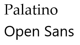
Introduction & Video Inspiration What is My Shortie Format? My shortie format is a branding intro/outro for videos for a real organization I am a member of and volunteer for called Soroptimist International of Borrego Springs. Who is My Shortie For? Soroptimist is a worldwide organization that is comprised of thousands of local groups that raise money and support for women and girls who need a hand-up in achieving their dreams and independence through education. “Soroptimist” is a made-up latin word that means, “Best for women,” which is the tagline for the organization. Our local group, Soroptimist International of Borrego Springs, is a small group of women who raise money for scholarships, mentorship opportunities and career workshops for local girls. We also give away scholarships to women and girls pursuing their educational dreams. What is the Goal for My Shortie? I would like to start creating promotional videos that raise awareness for our mission, document the group’s activities, and also raise money to help more women and girls. A professional looking branded “intro/outro” will really help our awareness and fundraising campaigns be more polished. What is the General Style of the Organization? Soroptimist has a color palette that must be adhered to so the look and feel are the same across all our groups around the globe. They also already have a logo and mission/vision language. I feel the organization feels a bit dated, so I would like to create an intro/outro that attracts a younger audience. Empowering, Inclusive, Warm, Encouraging, Trustworthy Design Elements Since "Soroptimist" is a real organization, there are two approved fonts that live in the logo itself, and also a hex code as defined by a branding guide. I am taking a little bit of liberty with cropping the logo and instead using Palatino in my After Effects composition for the name "Soroptimist." The other three fonts I researched to use for a handwriting effect. They are all on Google Fonts. I wanted to find a font that looked like real handwriting, but was easy to read with the "appearing out of air effect" I wanted!
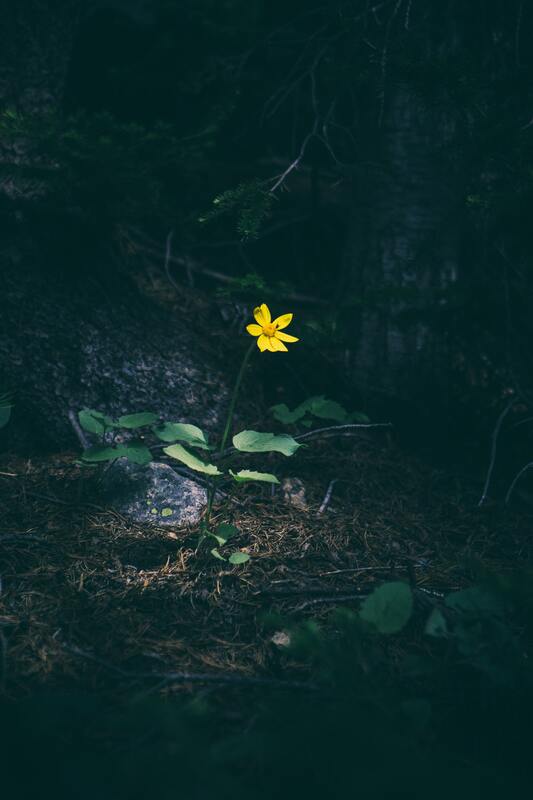
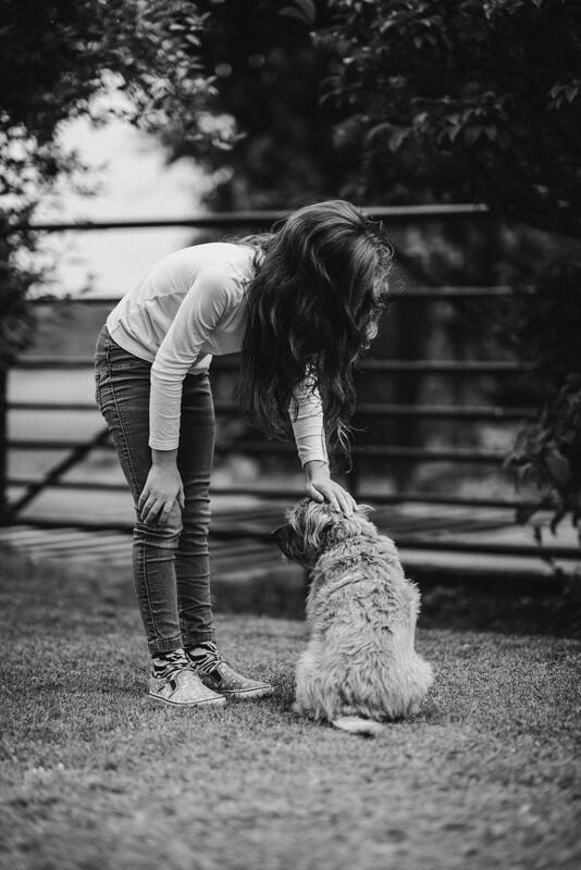
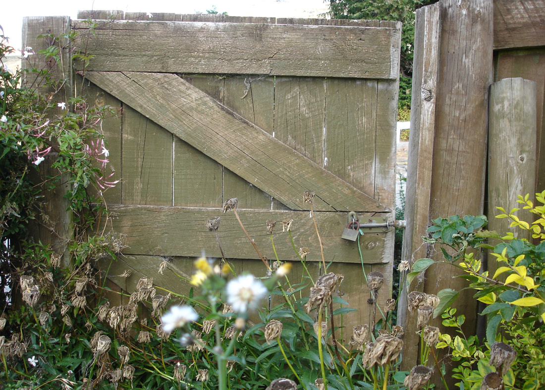
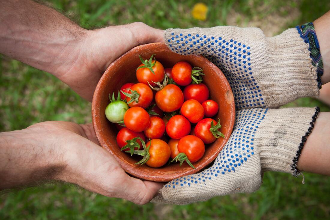
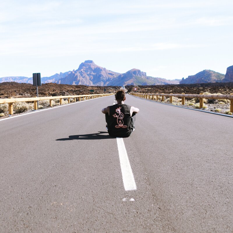
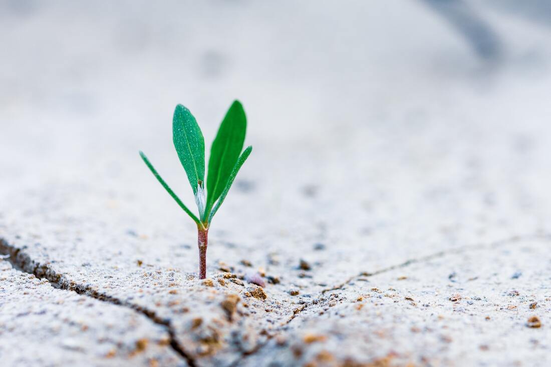
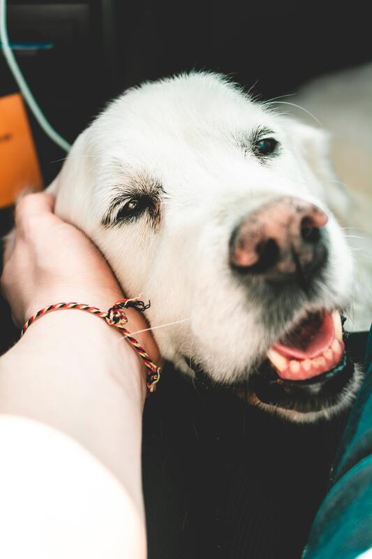
PATRICK HAND (GOOGLE FONT) 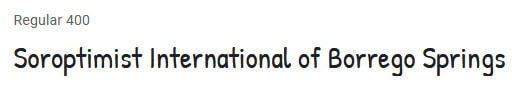 SRIRACHA (GOOGLE FONT)  SEDGEWICK AVE (GOOGLE FONT) 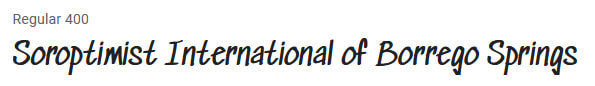 Sounds and Music Inspired by "ENOUGH" Images Inspired by "ENOUGH" This is a word I've often thought about since the pandemic happened. My definition of it has changed for sure. The first two images are evocative of the loss of the connection and type of busy-ness I used to have. The rest are more "simple pleasures" which truly fulfill me. Growing a tomato plant, sharing veggies with neighbors, petting a dog... they all are rather singular scenes, but yet they are somehow appealing, fulfilling and comforting for me. first draft: "ENOUGH" Lacking connection, missing people, and vanishing events. Empty roads in the morning and shadowed store windows where once bustling and summer-tinged tourists walked. I am lacking my people. Missing a job and a purpose to “clock into” every day. But there’s more fresh air. There is time to slow down and notice the caterpillars that sleep in my roses. I know the first names of all the birds that fly through my backyard. I know the names of my neighbors, even remember their birthdays, the shared, colorful (shining like jewels) fruits and veggies of our gardens gifted to one another on doorsteps and shared fence lines. In a season of lack, I have a roof to shelter me from the sun and a garden to enjoy it in. There is time to know the flora and fauna. There is so much to miss, a presence-of-others sized hole in my heart but what I have is ENOUGH. Being on a first-name basis with the neighborhood is enough. Lost importance, lack of purpose, found purpose to enough importance. Abundant gifts of thoughts and encouragement are enough. Sidenote: I almost went down a very dark path with this word. As in, like, "Enough already!!!!!!!" There have been a lot of moments about that recently. It's been like a year of headdesks. 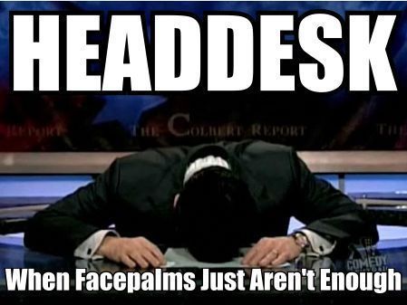 Stephen Colbert from "The Colbert Report" |


 RSS Feed
